Riccardo Tisci went H*A*M and creatively directed the cover for Jay and Kanyne's recent single. My first impression of the artwork was cliche ghetto fabulous. Barking rottweilers, chunky chains, and CROWNS? -Nice try, but I'm far too evolved for that... But the artwork was an extension of the Givenchy Fall Men's Collection [duh] and made much more chic sense after the runway show.
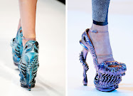
possible peeks into the woman's collection?
mad dog / calm dog
loved the albinos in camel
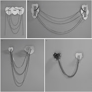
Inspired by everyday gear men wear on the street Tisci adds value to the pieces with buttery leather, vivid prints [usually hard to achieve on dark colors], small zips, and actual chain details. I particulay love the prints on the flannel, they look "dip printed" and the use of back packs in the styling.









No comments:
Post a Comment